Our brand identity emphasizes inclusivity, honesty, and sustainability. Estoria is authentic and meant for anybody embarking on a new skincare journey!
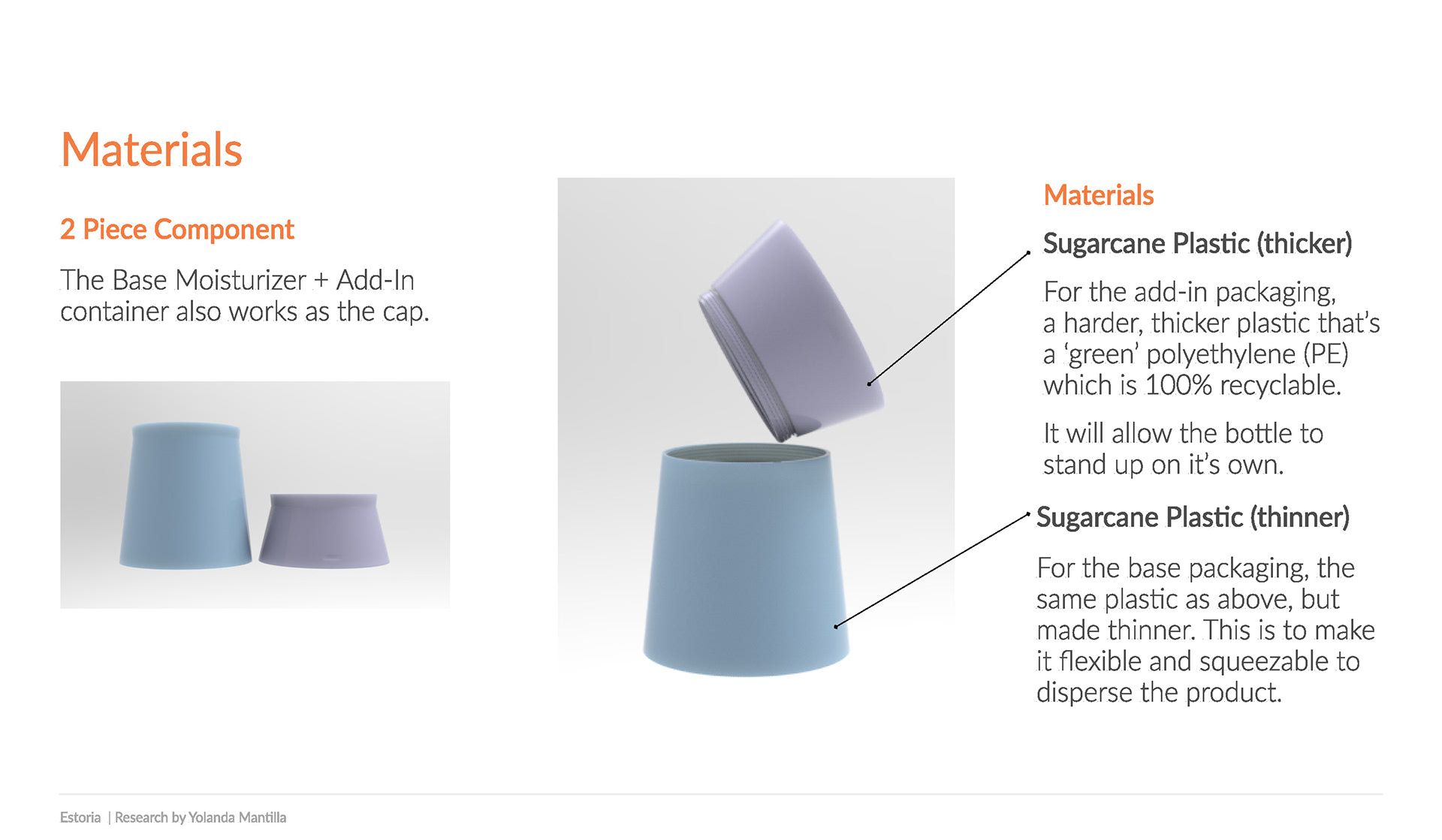
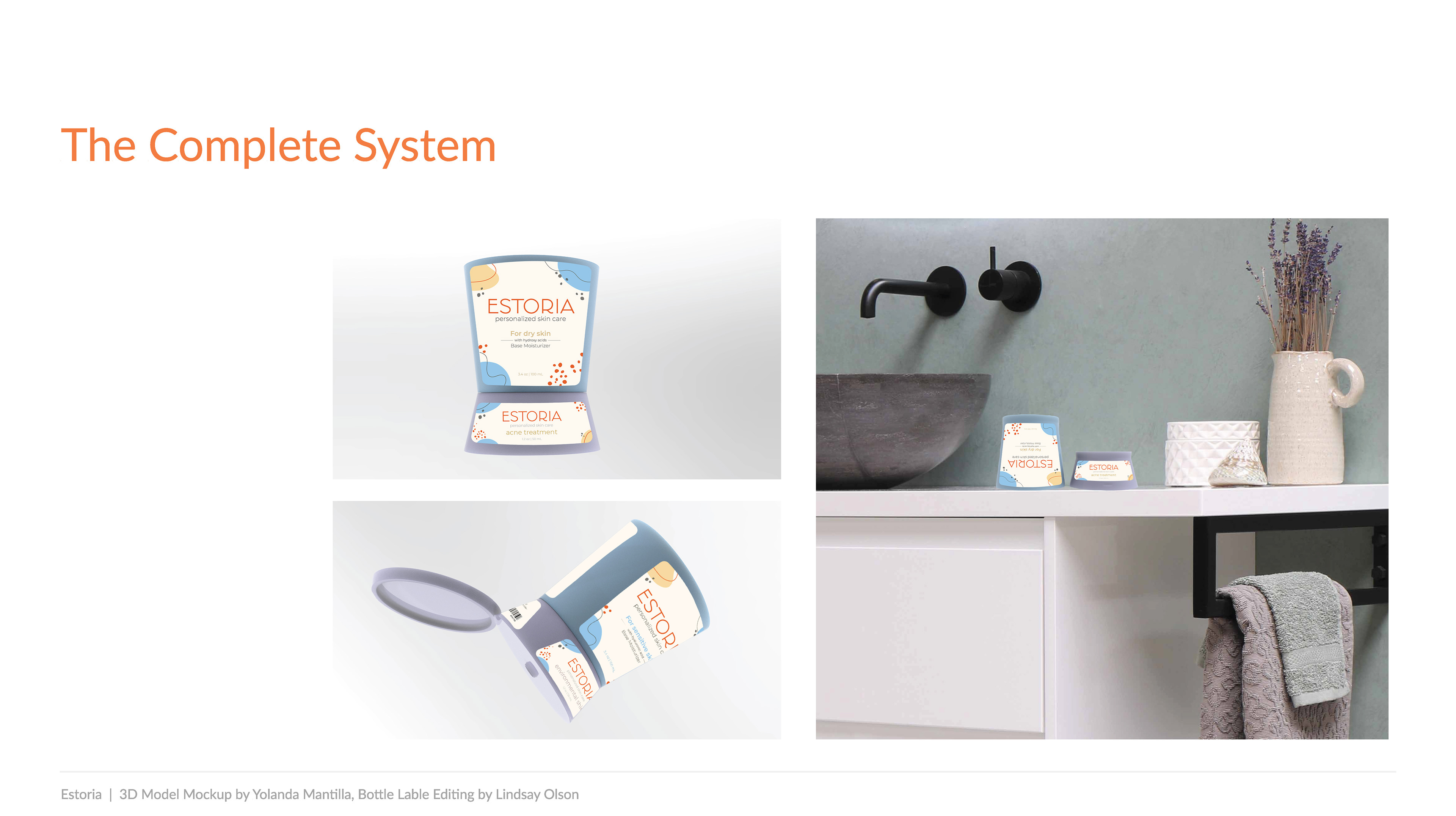
2 piece component, 3 bases and 5 add-ins, each targeting specific skin types and consumer needs.
3. The Process
I follow IDEO’s human-centered design and UX design thinking process to ensure my design decisions are supported by user research and feedback.
I follow IDEO’s human-centered design and UX design thinking process to ensure my design decisions are supported by user research and feedback.
4. Understanding The User
As a team, research was a priority during the creation of Estoria Hourglass. We wanted to make sure to put our users first so we conducted a Google Survey to determine how people felt about skincare products and their motivations behind purchasing them.
As a team, research was a priority during the creation of Estoria Hourglass. We wanted to make sure to put our users first so we conducted a Google Survey to determine how people felt about skincare products and their motivations behind purchasing them.
“Most fragrances are too overpowering and smell super artificial.”
“I can't use fragrance products on my face due to sensitivity issues.”
“Fragrances often include more chemicals and alcohol products, which tend to dry out skin.
I like to keep it natural with more organic ingredients.”
“Many scents trigger migraines.”
5. My Role
Because I was the User Researcher on the team, I was able to do a brand audit. I looked at 30+ brands within Target, Ulta, and Sephora. There were several things I observed.
1) Brand Identity Matters. The competition is fierce, with unlimited options, it's important to create a packaging design that stands out and raises interest.
2) A clean and professional branding can increase consumer trust.
3) Providing clear instructions and information on ingredients is a huge priority
for consumers. But they will do their research regardless.
4) There was a lack of instructions/information about products in each area!
for consumers. But they will do their research regardless.
4) There was a lack of instructions/information about products in each area!
Supporting Research
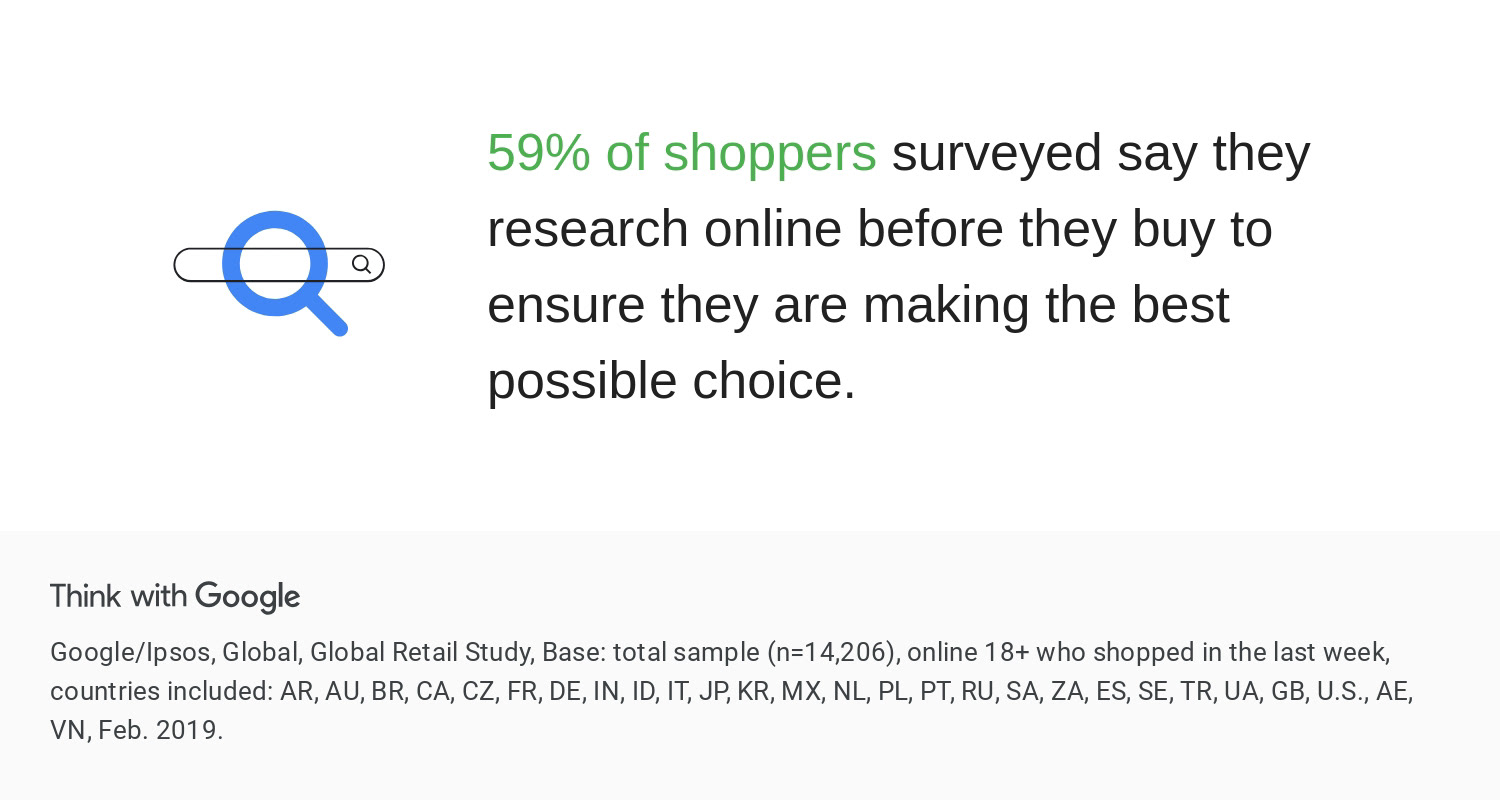
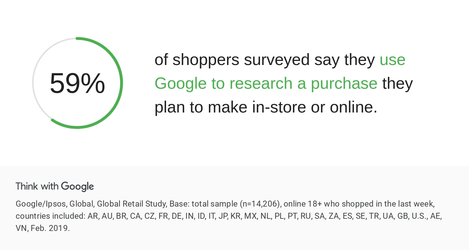
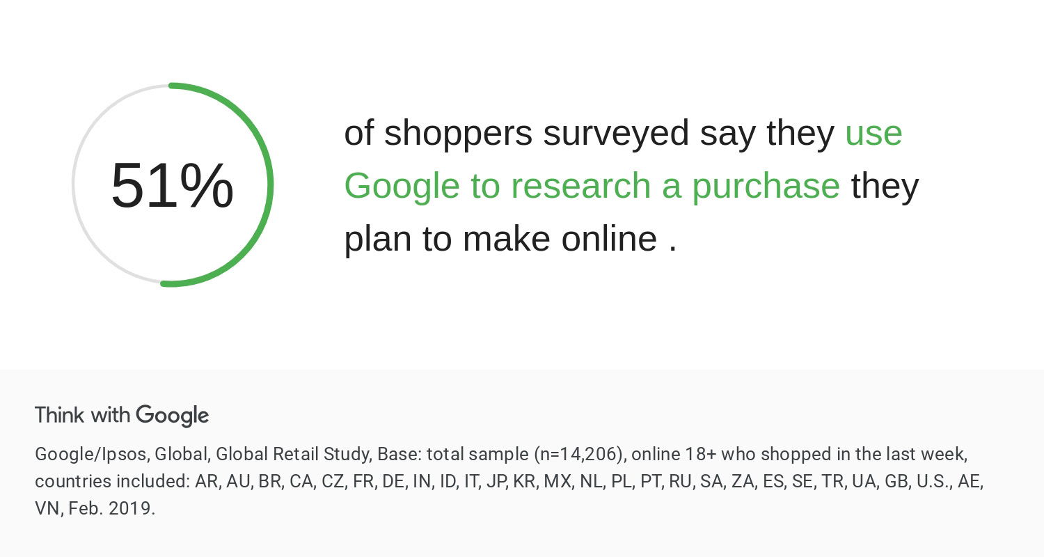
eMarketer reports that buyers who valued quality the most were more likely to shop directly from a site (64%), while big-box stores won shoppers on price (28%).
I looked at over 12 products that we considered to be competitors. These 5 have divergent qualities to that we want to incorporate/learn from. These 5 products fall under three categories Daytime, Nighttime, Gel Moisturizers.
Taking a closer look at the list, there is a spectrum of prices for each product (low as $13-$52). Based on setting our target audience os young professionals who care about their skin, we decided our product price would range from $26-$35.
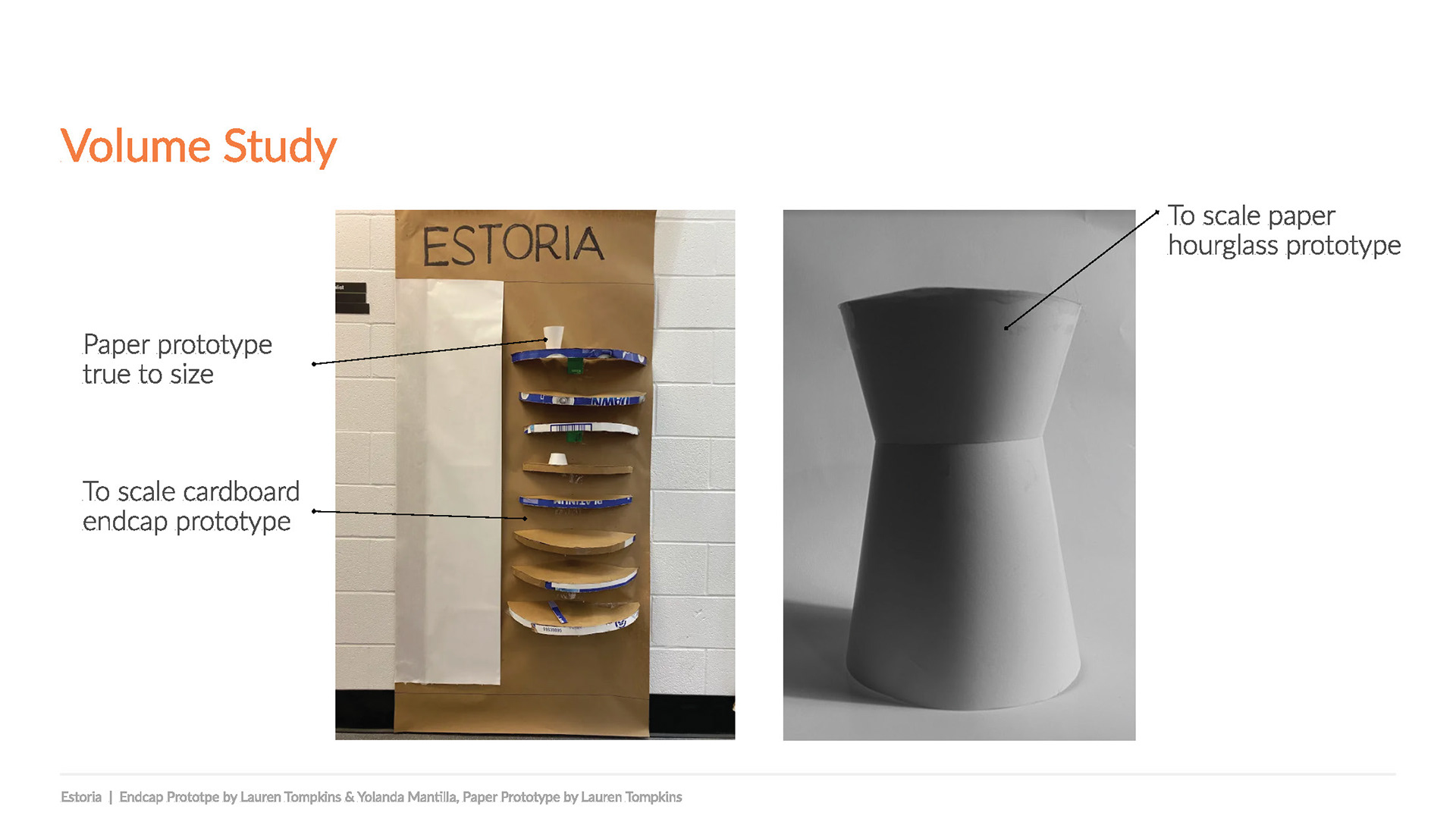
Although this was a team project I played an important role in the divergent ideation phase. We had tons of ideas, like dissolvable pills that could have serums in them. I had some ideas to use a rollerball stick to prevent the user from having to use their hand for application. There was talk about syringes...but it felt too medical. Ultimately, we landed on using a unique hourglass shape.
Why the Hourglass?
1) It was the easiest way to connect the parts (the base and the add-ons)
2 An hourglass design would intrigue new prospective buyers.
Why the Hourglass?
1) It was the easiest way to connect the parts (the base and the add-ons)
2 An hourglass design would intrigue new prospective buyers.
My team mate Yolanda Mantilla and I sketched each package design idea
The Evolution of the Packaging
Client Feedback on Version 2 Designs
"Make it clear what's what, base vs. add-in"
"Have different colors for each component (8 colors total)"
"On merchandiser fix contrast of background color with color of packaging"
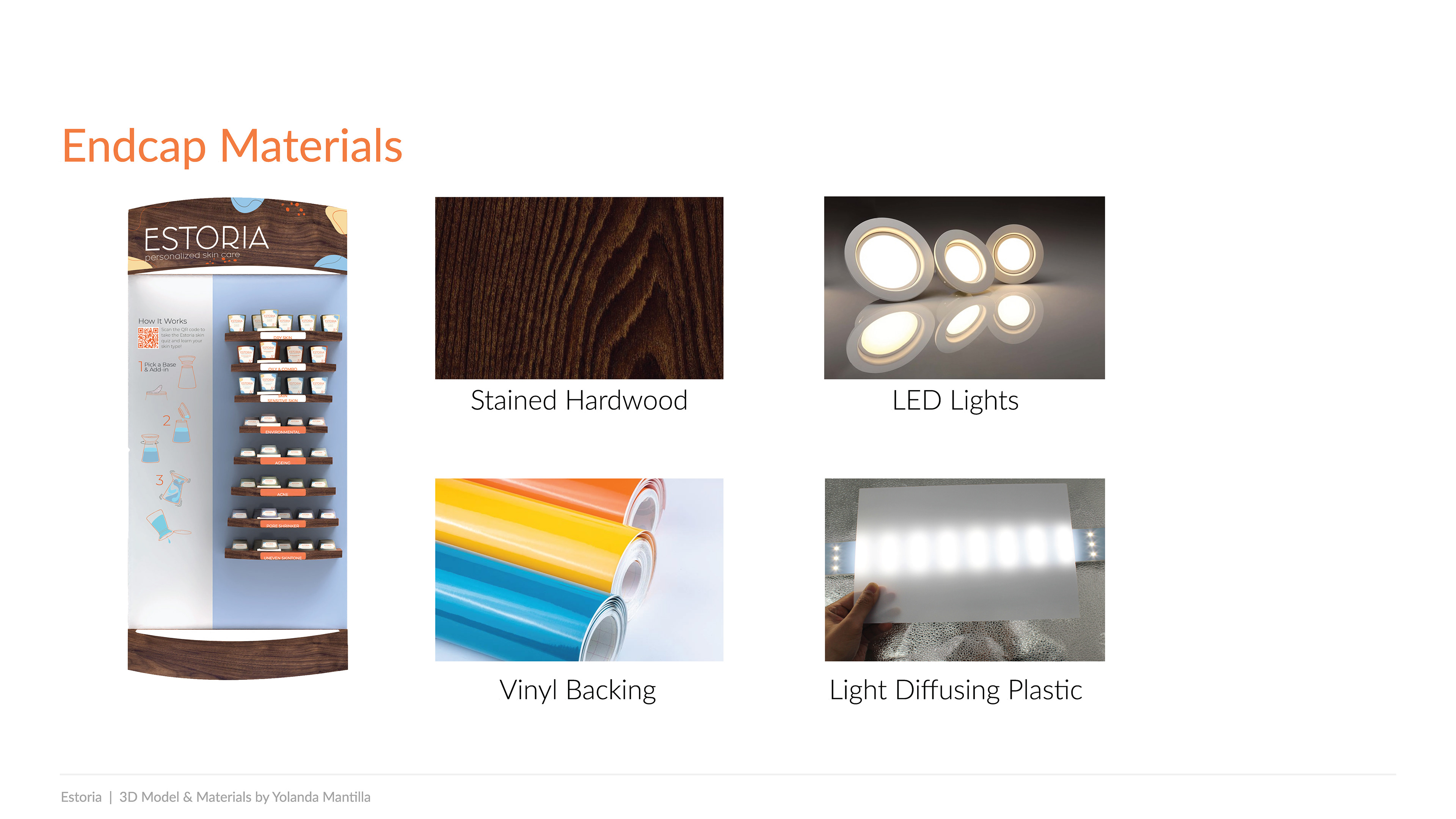
"Include instructions on display endcap"
"On the package if you do stickers the edges need to be rounded corners"
"Labels are hard to read when they're plain white"
"The shapes of the package look like 'giraffe' shapes"
All these versions were too busy. We needed a logo that was clean, trendy, and would have high readability in small sizes (context: logo needs to fit on a bottle and work on a large-scale display).
Version 1 outer package designed and rendered by Lauren Tompkins
Version 1 outer package designed and rendered by Lauren Tompkins
What's Inside?
As a brand we wanted to makes sure we stood by our values to make an effective product for all customers.
By conducting user surveys and talking to a licensed esthetician we were able to find out what type of
ingredients should be put in the add-ins and base moisturizers.
This is what we learned from the esthetician!
Great products/ingredients: Salicylic Acid, Beta Hydroxy, Glycerin, Benzoyl Peroxide, Hyaluronic Acid, Antioxidants, Retinols, Vitamin A, Alpha Hydroxy Acid
What to avoid: Fragrance, Essential Oils, Walnut Scrubs, and soaps intended for
use on the body
Trends in skincare: Korean Skincare, Clean Beauty, Oil Cleansing
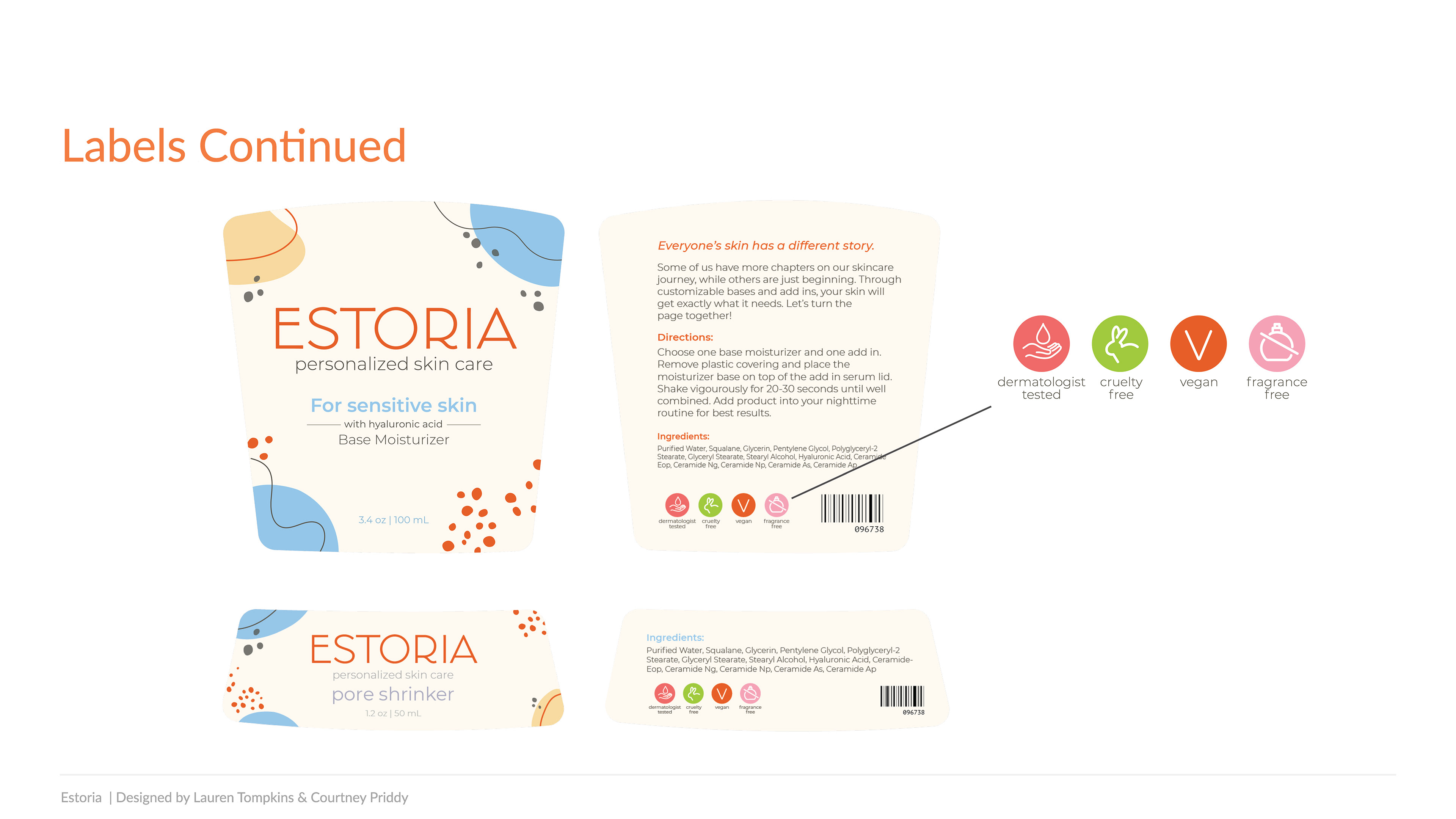
Opinion on fragrances: Should be avoided, while they aren’t guaranteed to cause irritation, they can lead to sensitivities. They aren’t regulated either.
How It Works?
Other Touchpoints
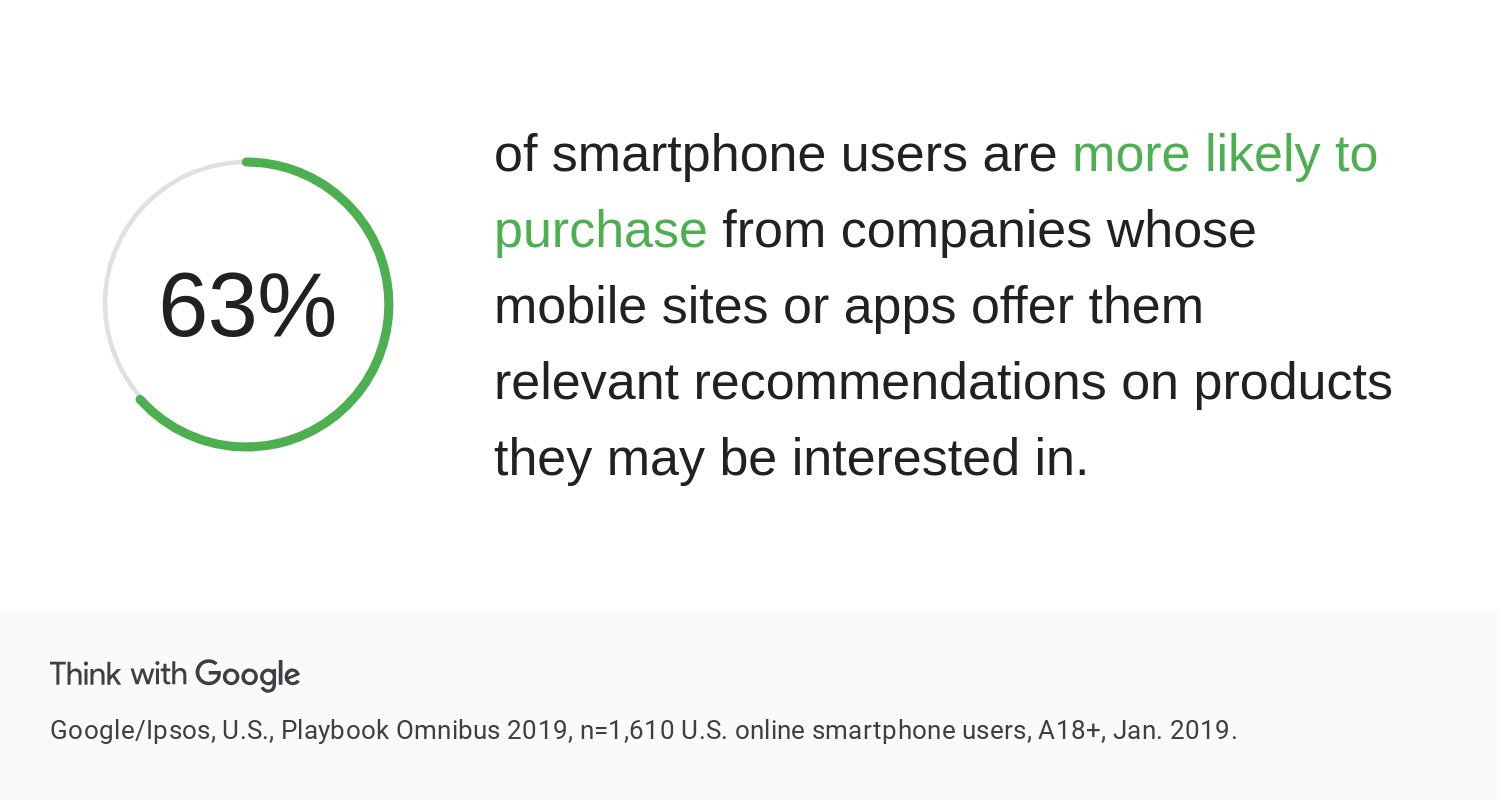
The skin quiz was an important part of our marketing strategy. We knew based on our research that using QR codes would set us apart from our competitors. So we made a skin quiz that people could fill out to discover what base and add-ins they should buy based on their skin history.
The Final Lineup
More Research & Development
Special thanks to our team XXena: Lindsay Olson, Courtney Priddy, & Yolanda Mantilla!

