1. The Challenge
Often people are surprised that so many Americans struggle with reading even in their adult age. Unfortunately, this social issue isn't talked about enough. Part of the reason why people with
lower reading levels are not more vocal is due to fear of
judgment or embarrassment. After seeing the alarming statistics
and evidence, I realized that there was an opportunity to make
adult education more accessible.
lower reading levels are not more vocal is due to fear of
judgment or embarrassment. After seeing the alarming statistics
and evidence, I realized that there was an opportunity to make
adult education more accessible.
2. The Opportunity
After doing discovery research I quickly realized that there were
few apps that were exclusively for adult education. But there
were copious examples of educational children's apps, games,
and workbooks.
few apps that were exclusively for adult education. But there
were copious examples of educational children's apps, games,
and workbooks.
Key Features
American Sign Language (ASL) Setting:
Under the settings tab, there is an option to add ASL and English captioning.
Placement Test:
This quick and easy test is a placement test to find out what level a user is at. Based on the result, lessons, games, and books will be curated to fit their respective level.
Audio Walkthrough:
While the user interacts with the app the audio walkthroughs will gently guide them through activities.
Easy Sign In:
Users have the option to sign up using
their phone number, Google Sign In
and or Facebook.
Users have the option to sign up using
their phone number, Google Sign In
and or Facebook.
Old promotional Video made using After Effects
3. The Process
I follow IDEO’s human-centered design and UX design thinking process to ensure my design decisions are supported by user research and feedback.
I follow IDEO’s human-centered design and UX design thinking process to ensure my design decisions are supported by user research and feedback.
4. Understanding The User
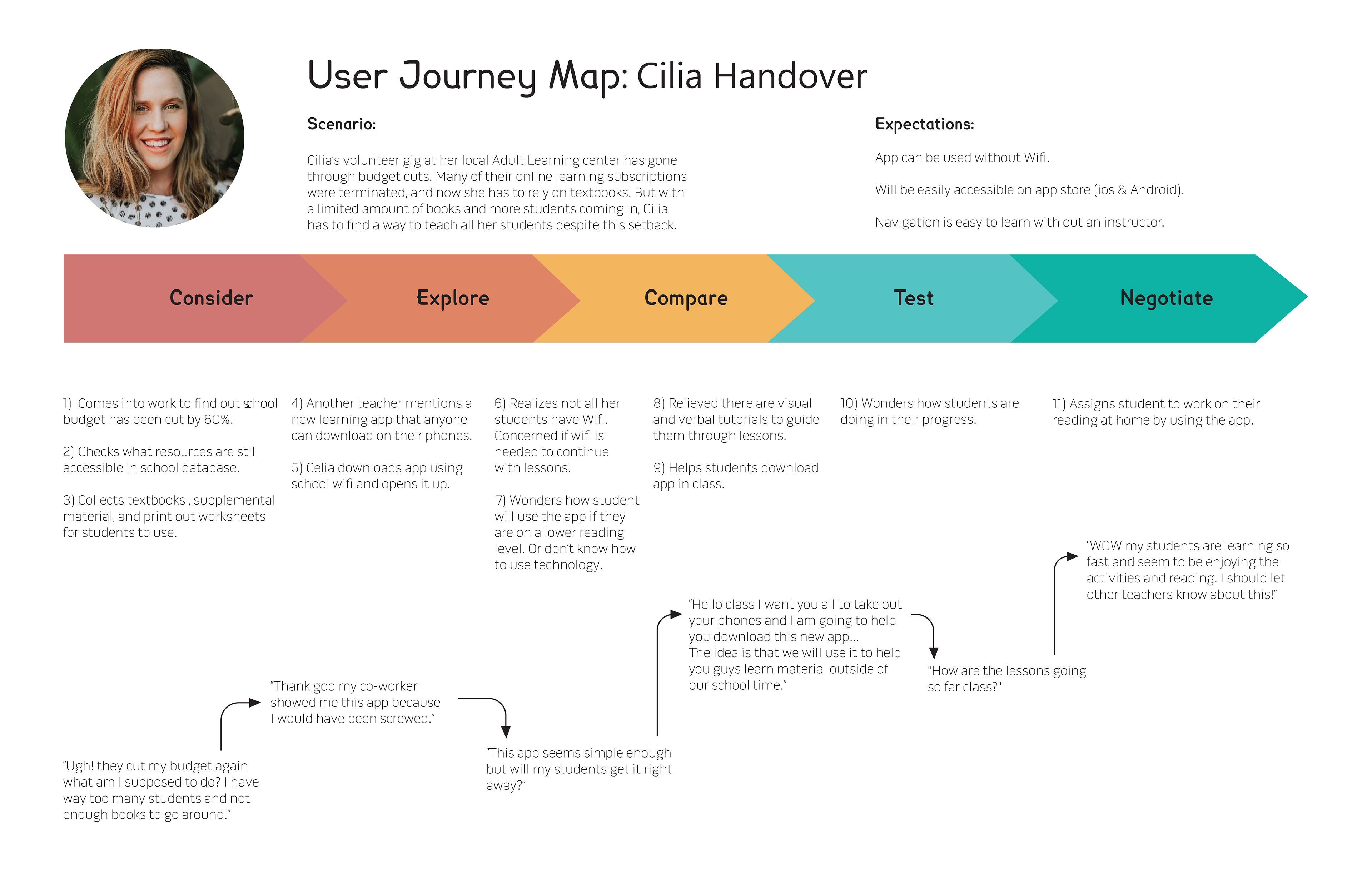
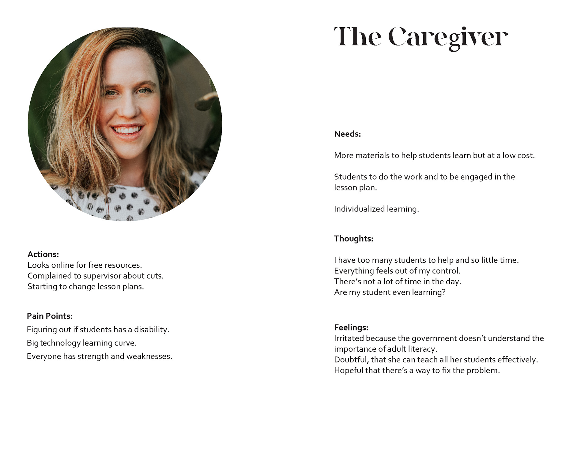
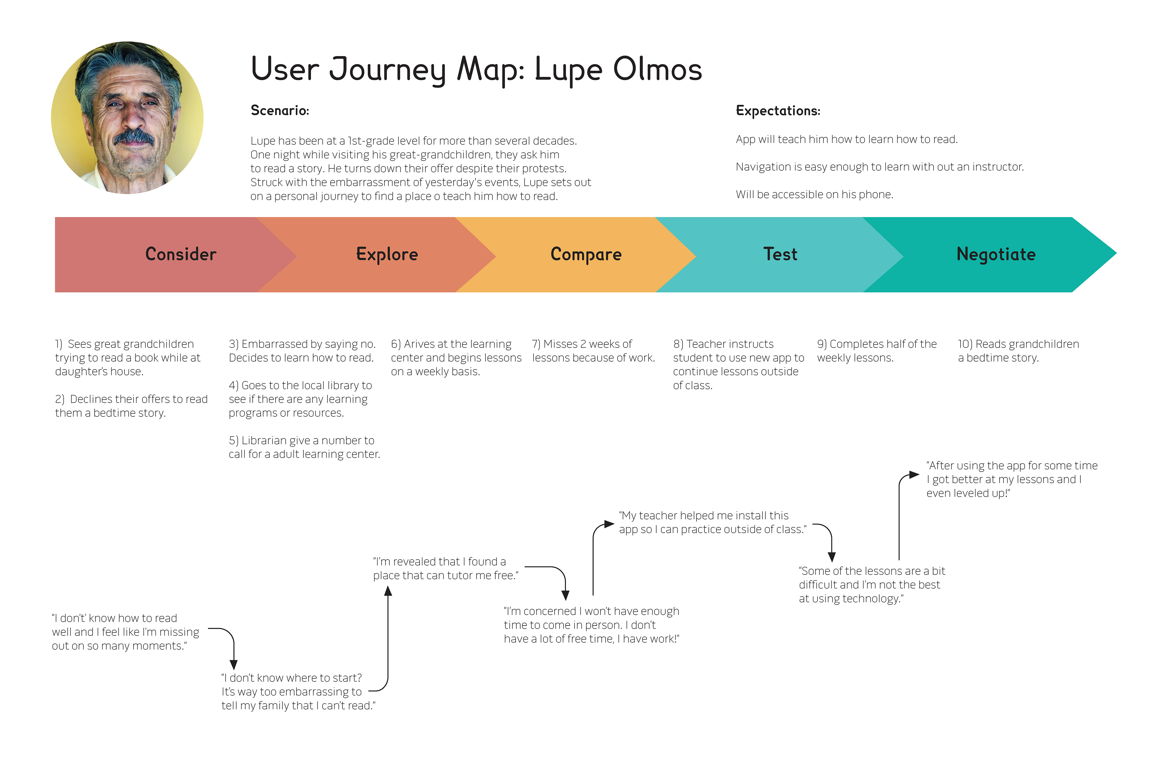
To understand more about my users' workflows and relationships with technology, I conducted user research with 13 participants. This led to the development of 4 personas, and 2 User Journey Maps, 2 Empathy Maps, and 1 User Archetype.
Survey and Interviews...Things I Learned
At the time of this project covid-19 was still blazing strong so I adapted and took an unconventional route
to surveys and interviews. I used Reddit forms for educators and adult education to gain more insight.
I also used Google Forms to ask more specific questions about people's learning experiences. Out of 12 responses, I had a large range of people who participated in the survey (ages 17-59).
User Personas, User Archetype & Empathy Maps
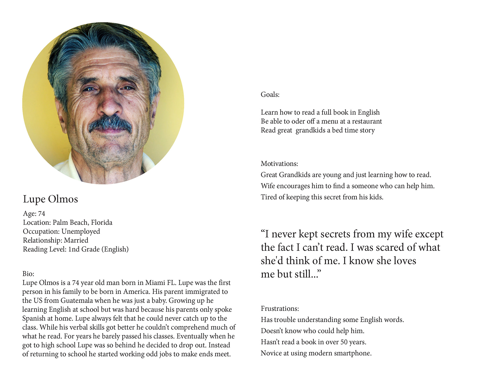
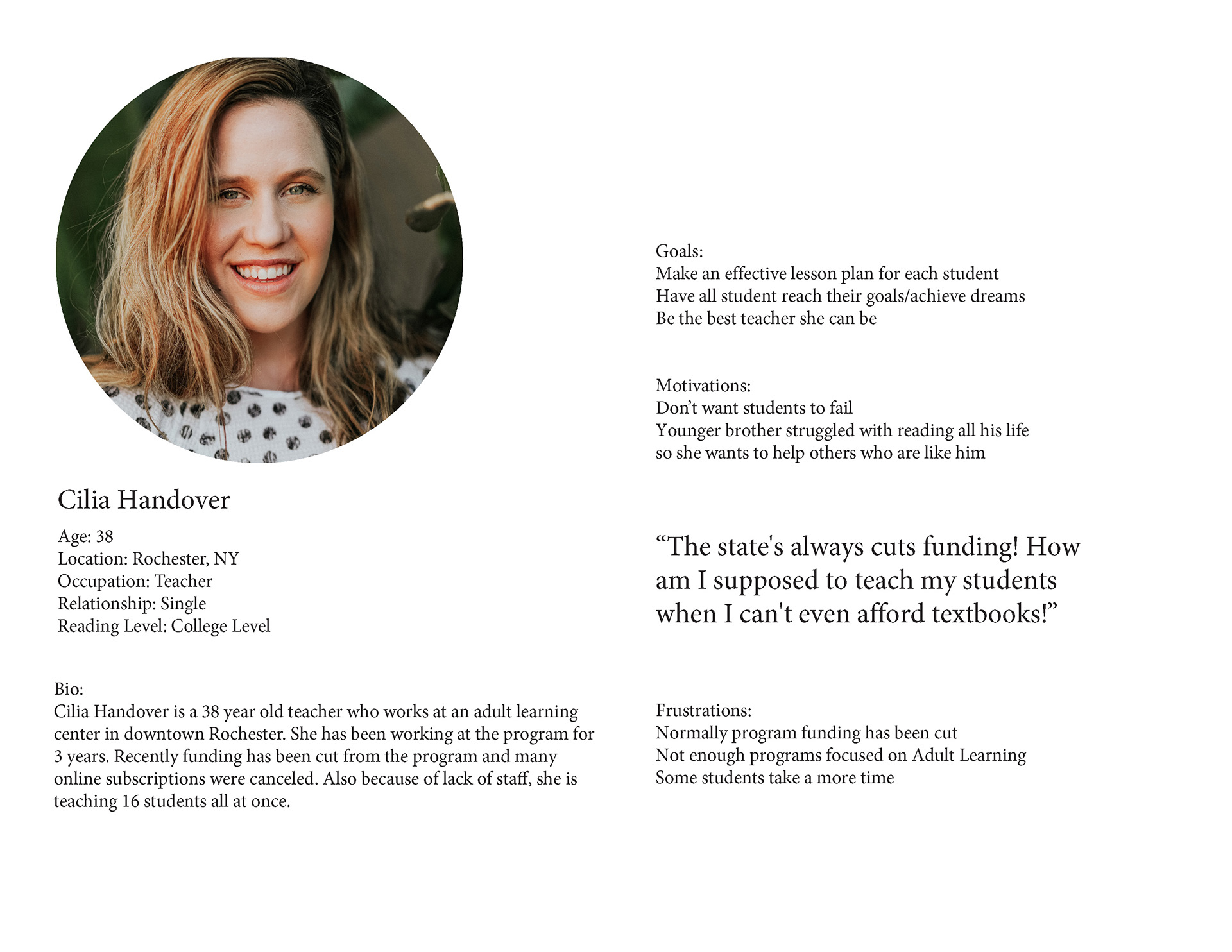
After compiling the results I took that information and created 4 personas. One being a adult learning instructor,a young adult with learning disabilities, a first generation Spanish American, and a middle aged woman with kids.
After compiling the results I took that information and created 4 personas. One being a adult learning instructor,a young adult with learning disabilities, a first generation Spanish American, and a middle aged woman with kids.
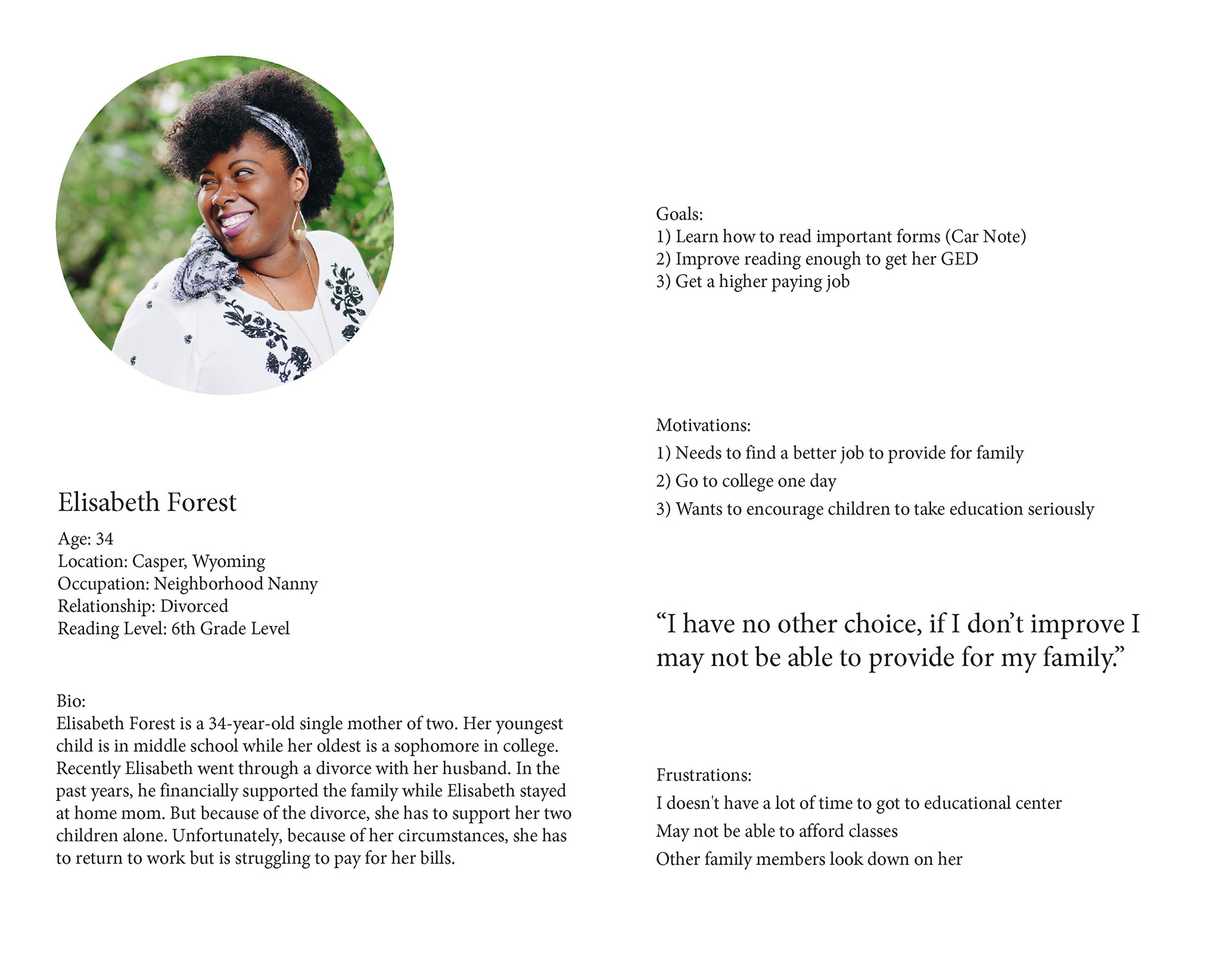
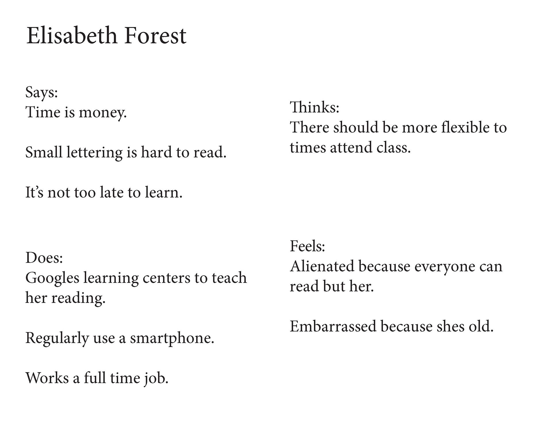
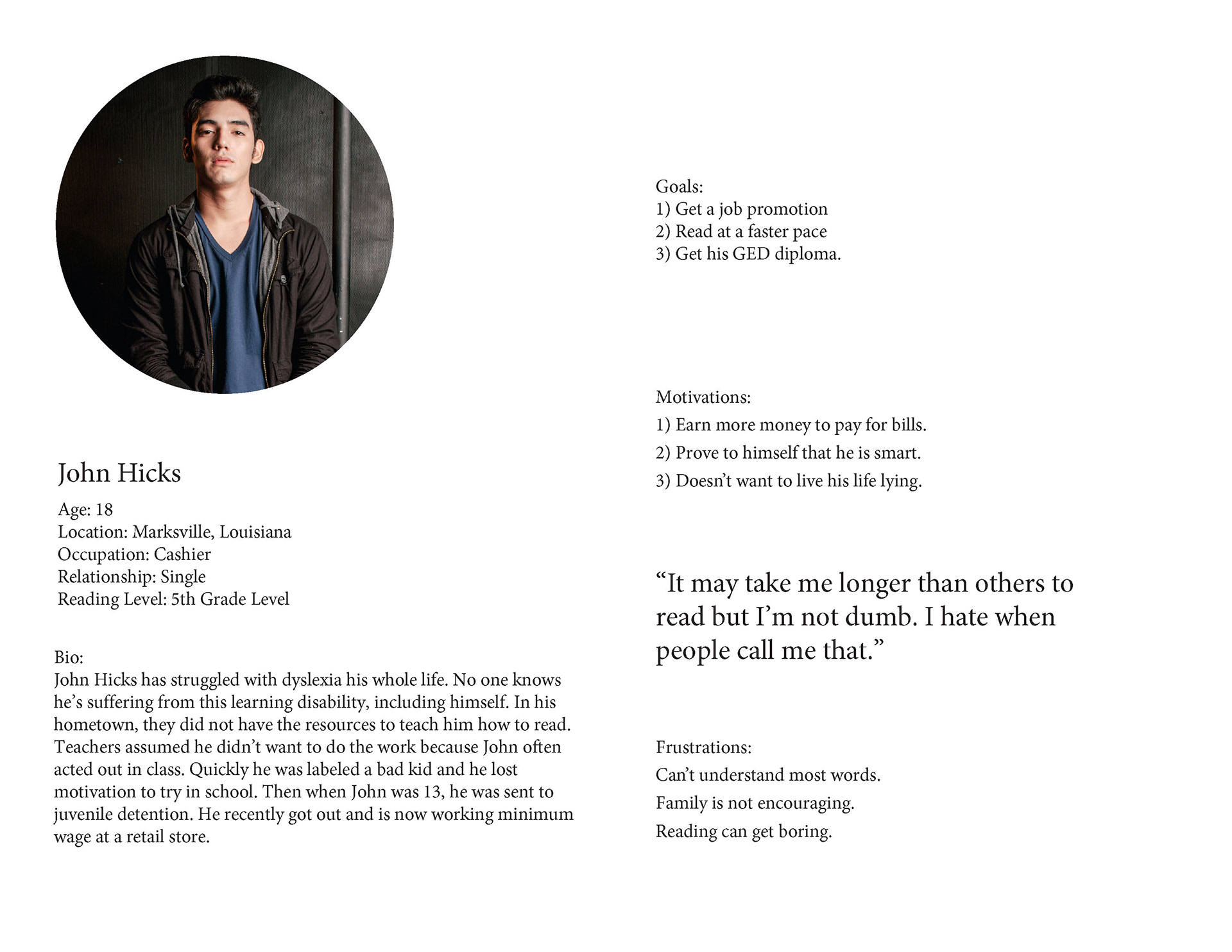
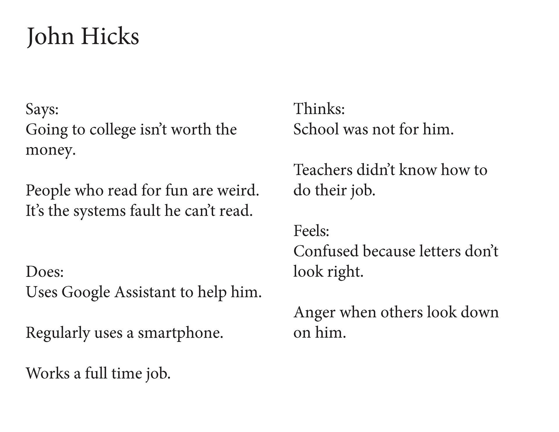
Challenges
Adult illiteracy has a large age range starting from as early as 18 years old to people past their 70's. So I had to think about the wants, needs, and pain points, of many types of people.
As I continued working I was confronted with many facts and questions...
All the apps on the market are for babies
or kids
How do I make an app that resonates
with all ages?
Some adults are technology challenged...
How the heck would anyone download
the app if they can't read?
If I use audio cues how would a person who's
deaf or hard of hearing use the app? That's a
whole demographic missed :(
Through conducting surveys and compiling pages of resources, I came to realize that this app would need a lot of user testing to effectively reach such a wide audience.
5. Applying Feedback To UX Design
After taking in all the research and feedback I then used that data to make specific features and design decisions.
A. The Preliminary Assessment: Understanding The Importance
While doing research I also had the chance to speak with a director of an Adult Learning School. She suggested looking at resources that had lesson plans already curated. Through my research, I was able to find the National Assessment of Adult Literacy (NAAL), a comprehensive test that evaluates adult literacy. Looking at sample practice questions I was able to call out areas of this test and apply them to the app's preliminary assessment feature.
The preliminary assessment acts as an easy onboarding which helps dictate the entire app experience. Through my research and interviews, I determined having a personalized app was imperative because each adult learner has various skills and comprehension. Some may be great at decoding, while others excel in math. Adult Learning is a spectrum, and no person's path to improvement is linear.
Offline mode for people who have no access to the internet
My demographic is broad and many people come from different socioeconomic backgrounds,
including homeless people or immigrants. Having stable internet is a privilege so I added an offline
version of the app.
C. Pre-downloaded books that can be read on and offline
6. Sketching Wireframes
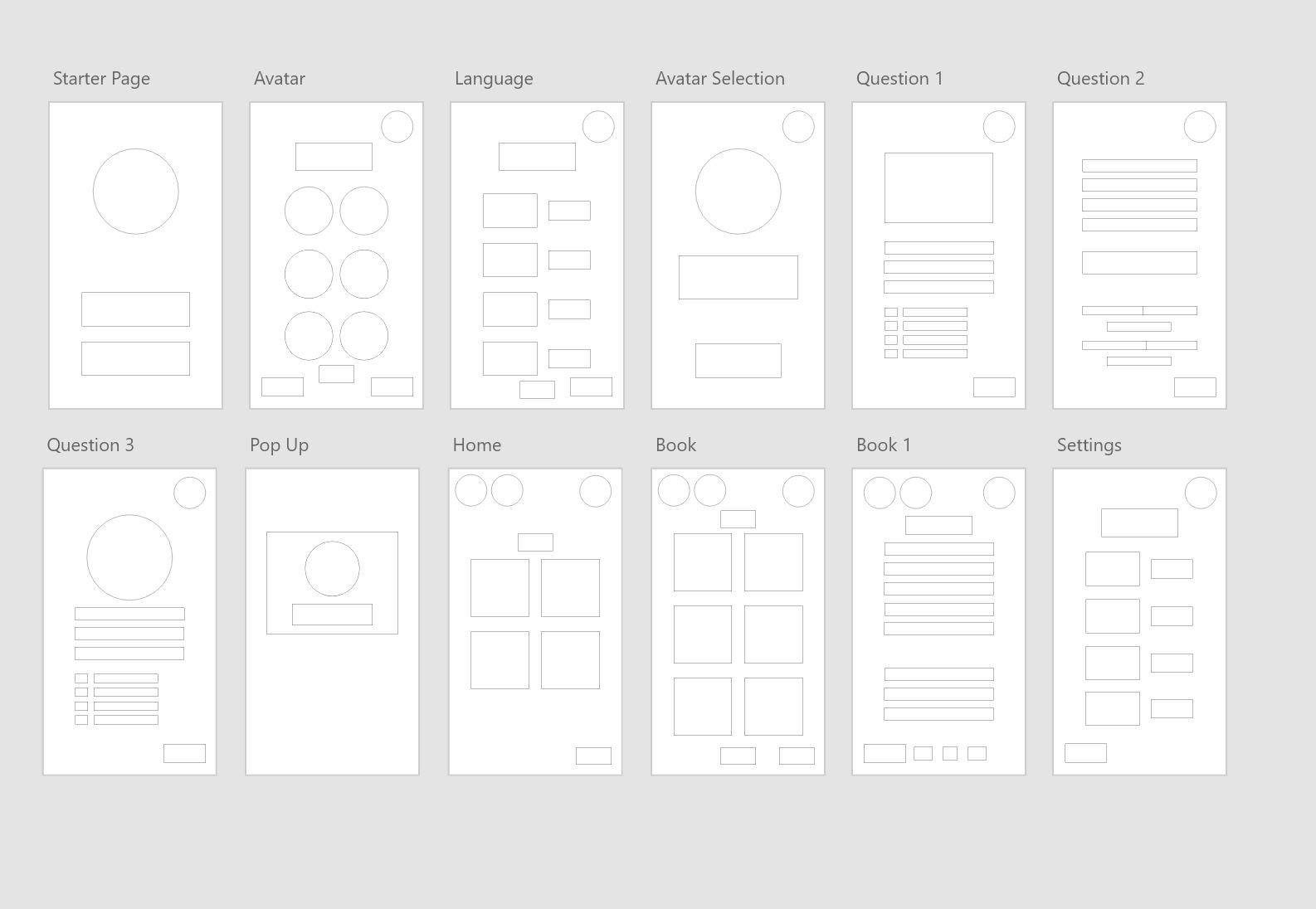
During this process, I flushed out what features were needed that would make my app both unique and efficient. After feedback from my colleagues and conducting user testing, I concluded that it was important to have a preliminary assessment, audiobooks, and an element of gamification to keep users coming back.


User Flow
App Walkthrough Part 1
App made with Adobe XD, Video made using After Effects
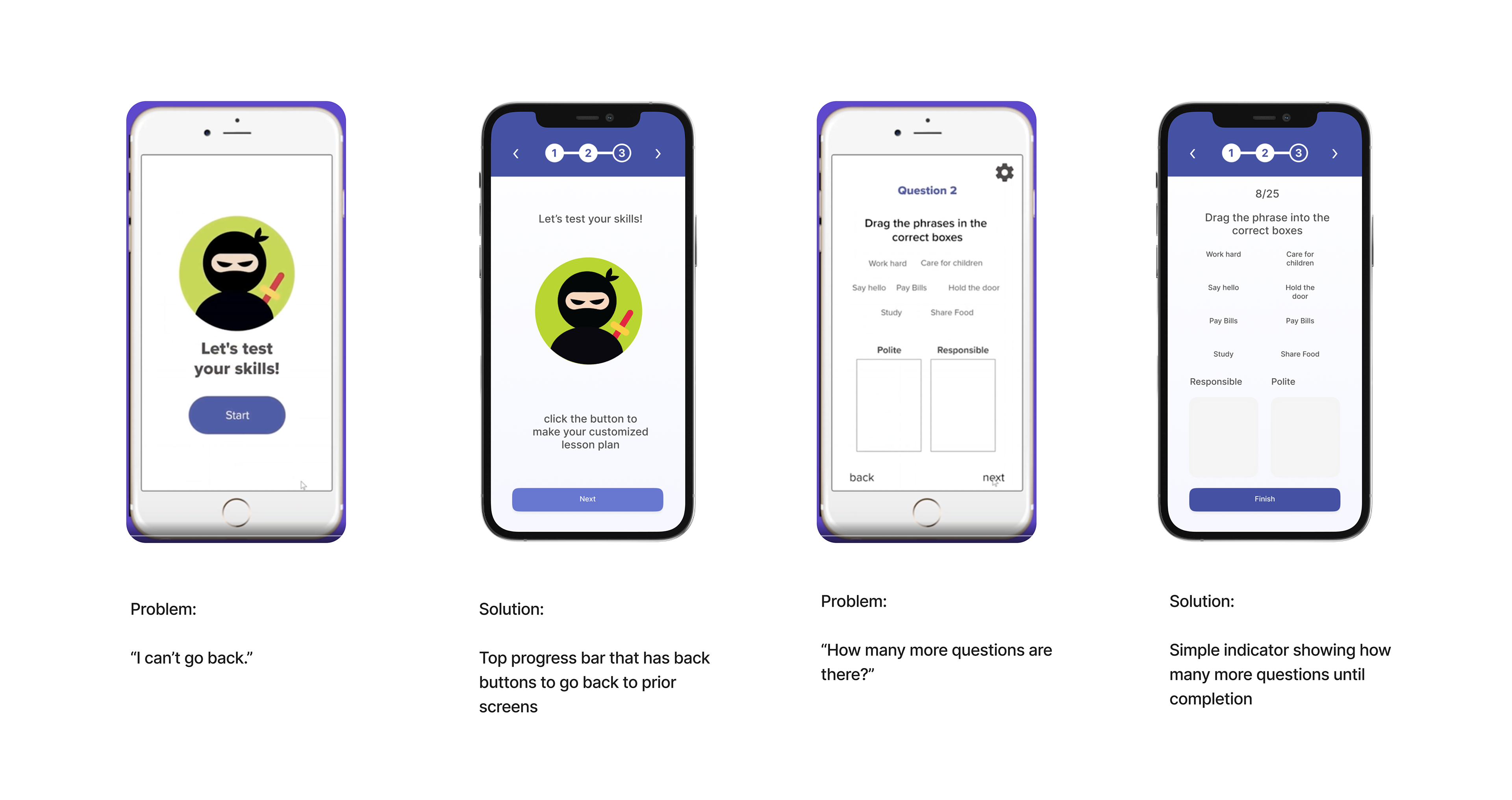
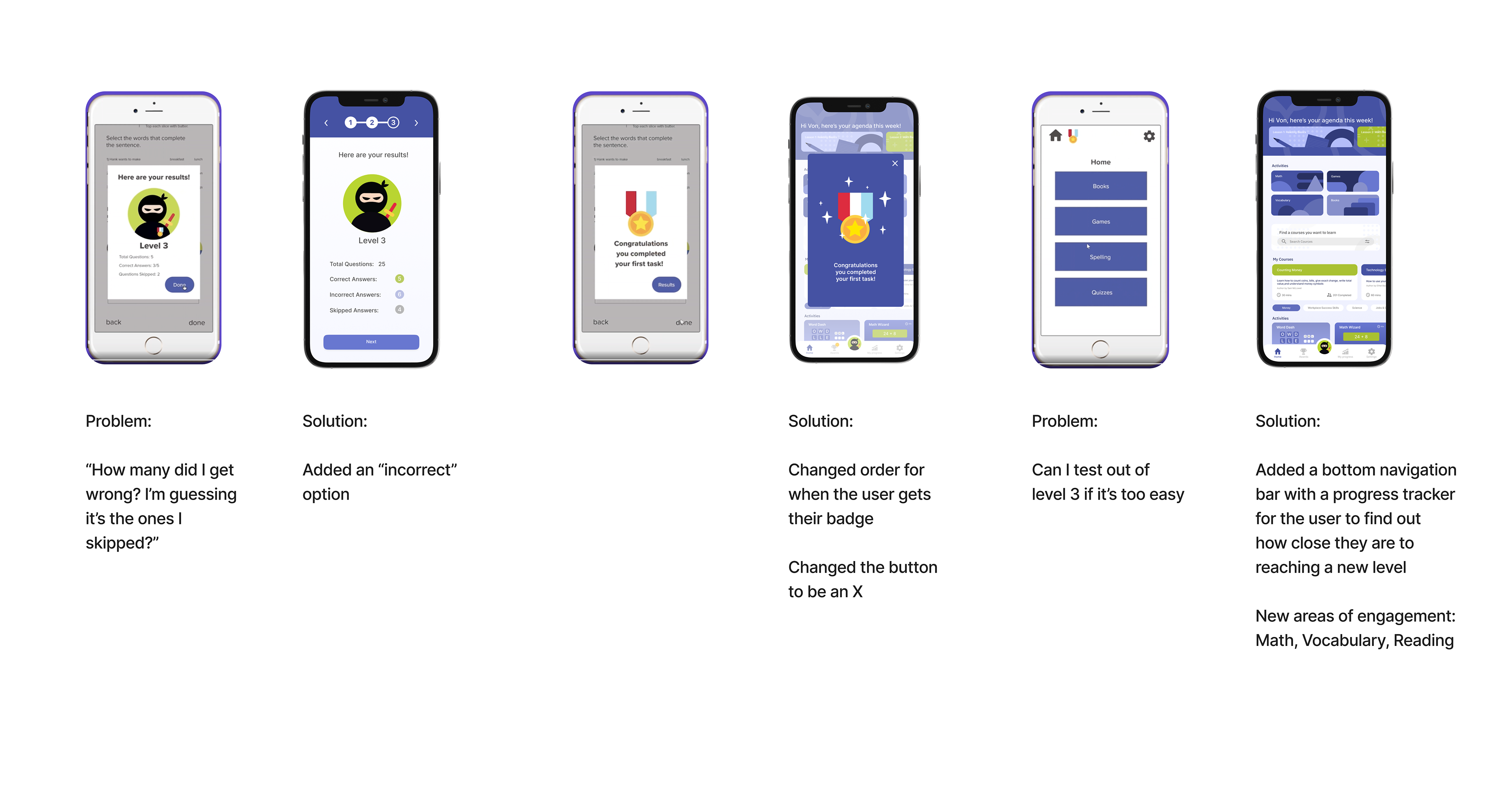
7. Round 2 of User Testing
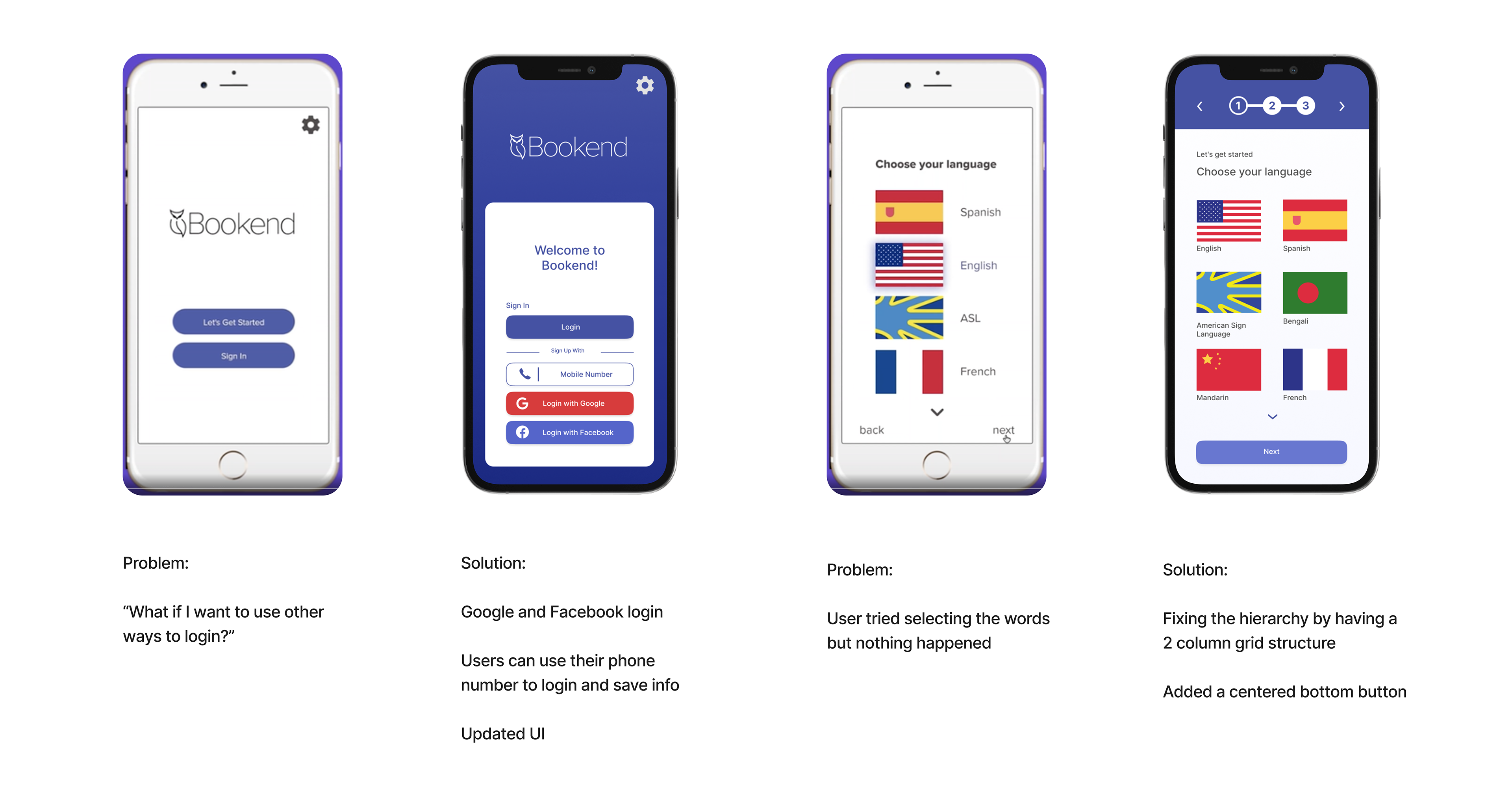
After the first round of ideation I was able to conduct user testing. My over all goal was to assess pain points the user
felt while clicking through the app. Based off their feedback I identified many problems with the UX and UI of the app.
felt while clicking through the app. Based off their feedback I identified many problems with the UX and UI of the app.
8. Lessons
Designing an app from front to end is a difficult task, but very fun to do. I enjoyed the research aspect the mostly
because I love empathizing with people and understanding the various mindsets a user can have. But because
I had to look at so many viewpoints, I realized it's difficult to put all the features you want into one single app.
Things I would change or add...
because I love empathizing with people and understanding the various mindsets a user can have. But because
I had to look at so many viewpoints, I realized it's difficult to put all the features you want into one single app.
Things I would change or add...
Adding audio tutorials that can play throughout the whole experience.
Another thing I think needs improvement is the ASL and captioning. I have to find a more logical
way for the captioning to come on the screen. I have to make sure it doesn't block
important information.
way for the captioning to come on the screen. I have to make sure it doesn't block
important information.
